
okayama korakuen
Okayama Korakuen is one of the three great gardens in Japan with natural beauty and rich history, yet its website was bland, outdated, and difficult to function. By identifying opportunities for improvements in the garden’s current website, we refined its usability and cohesion across desktop, tablet, and mobile platforms, helping users better navigate, appreciate, and plan their next visit to Okayama Korakuen.
UI Design
Graphis 2022 New Talent Competition
Silver Graphis for Website Design
Salute Design Competition
Honorable Mention for Graphic Design Interactive/Video/Motion
NSSC 17
Best in Category for Website: Prototyped/Programmed
The XD prototype for desktop is here
High-fidelity & Prototype
Along with miscellaneous prototyping transitions such as the opening transition and connecting to the garden map, I was specifically in charge of the flora, fauna, and floral calendar pages. This process of checking and rechecking the prototype in terms of filtering and card overlay allowed me as well as my teammates to explore Adobe XD thoroughly and troubleshoot as a team.
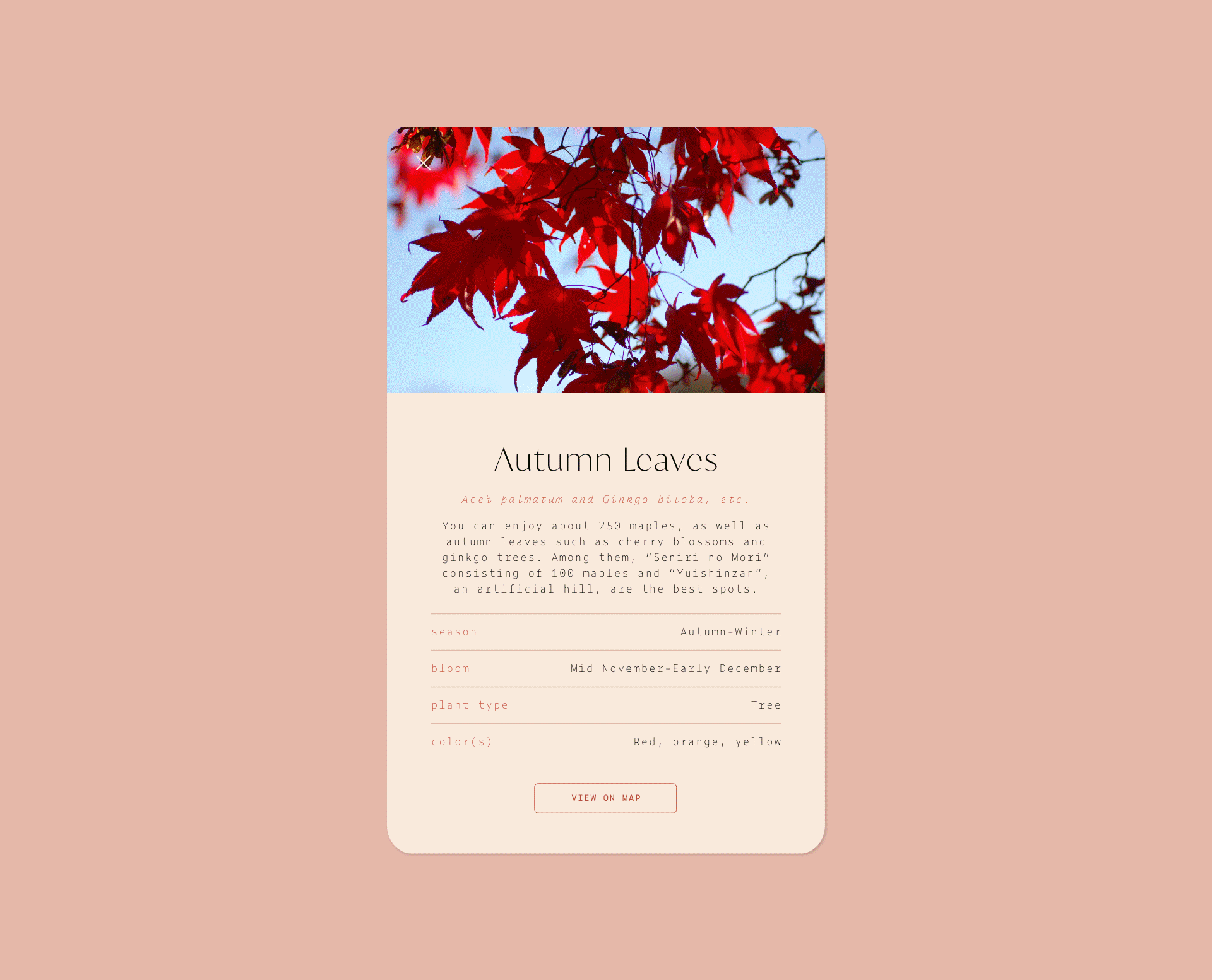
floral cards
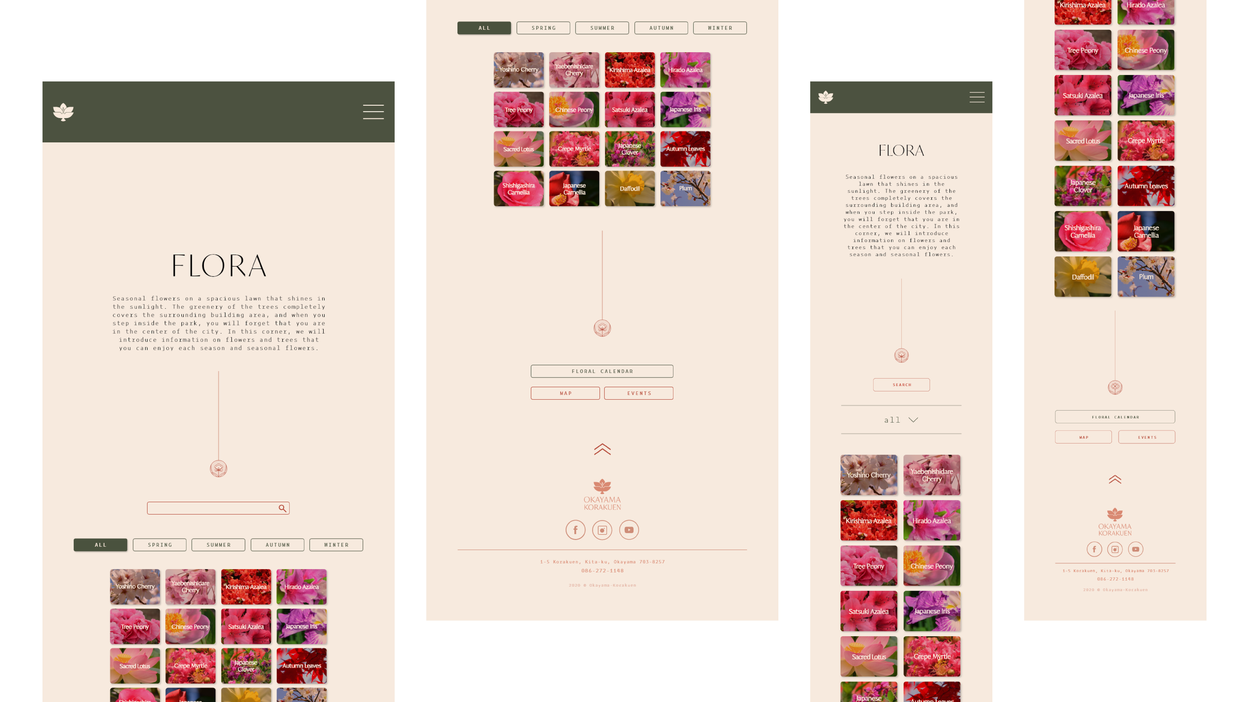
flora page on tablet and mobile
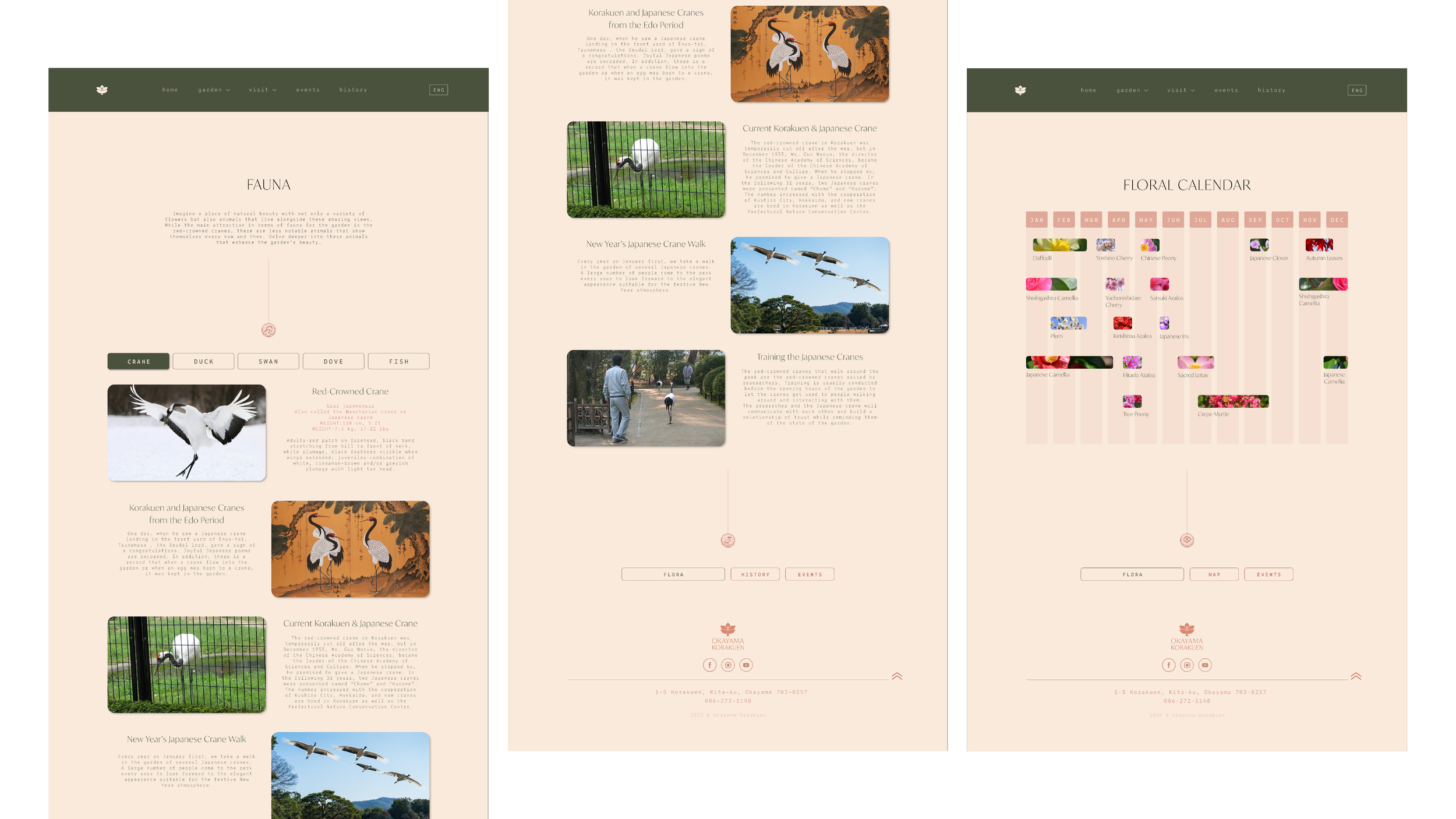
fauna and floral calendar page
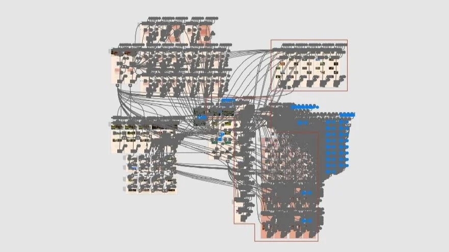
prototyping
Research
To understand the possible users we were appealing to, each of the group members made personas with their own needs and frustrations. Along with our personas, we included their user scenario and user flow when operating on our redesigned site. My user persona focused more on the flora and fauna pages of the site, planning a trip for his frail wife to see her favorite flower in the proper blooming season.


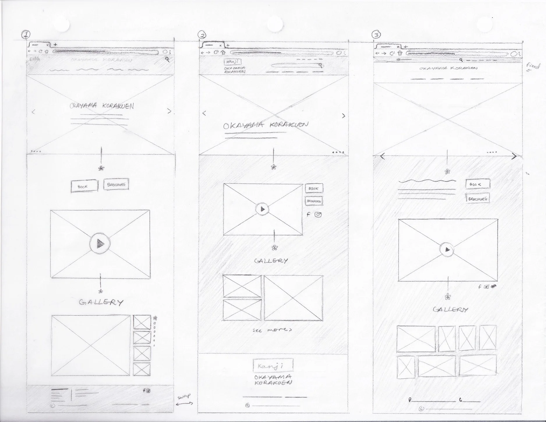
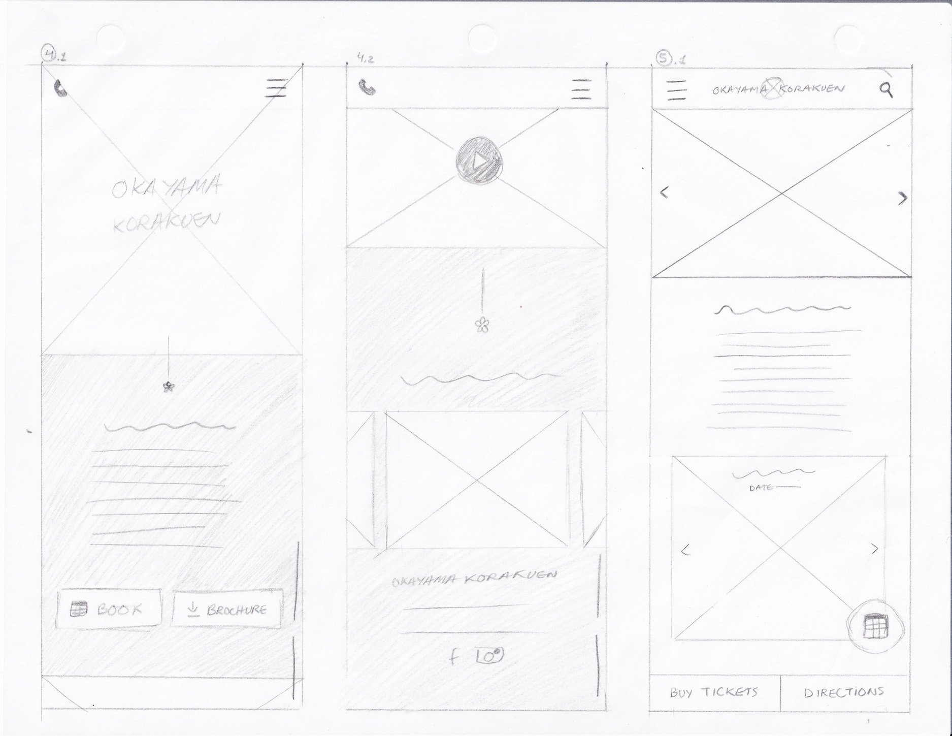
Low-fidelity
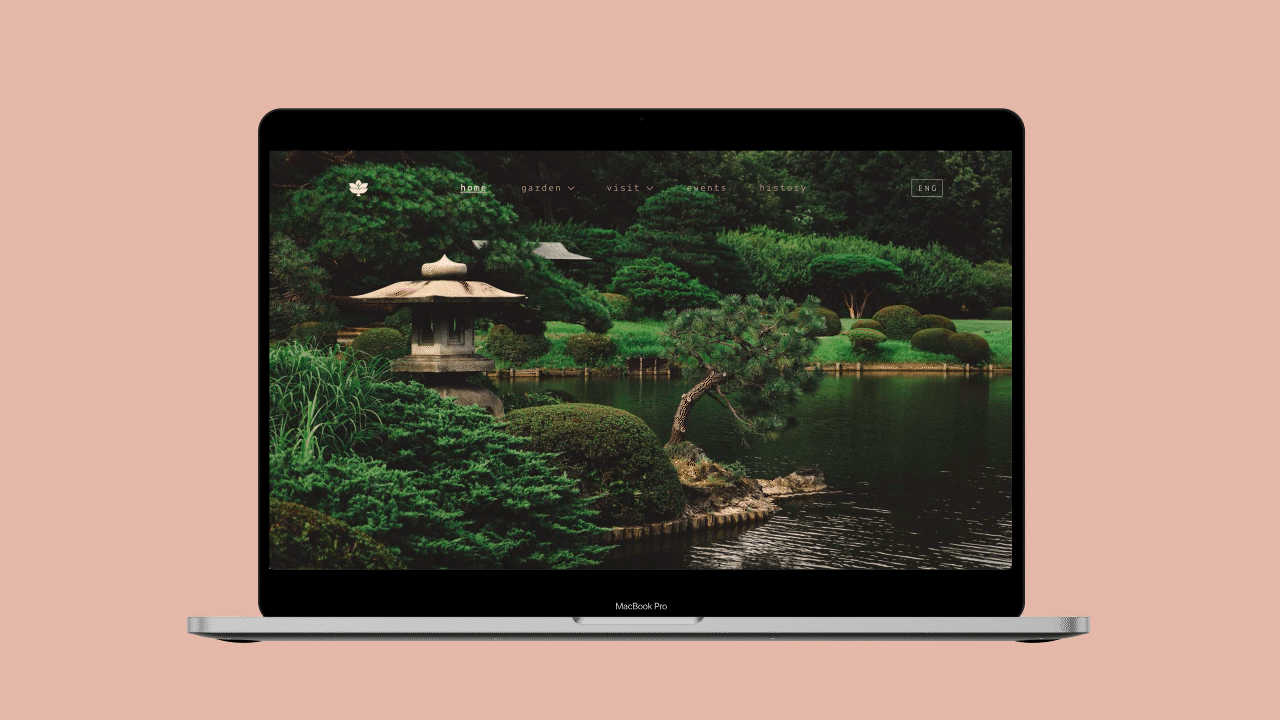
From the gathered research, we each then drafted low-fidelity options for the homepage. This design would lead to other design choices for the remaining pages. To make the website accessible on multiple platforms, we made sure to include both desktop and mobile sizes for the new Okayama Korakuen website.
low fidelity desktop
low fidelity mobile
Mid-fidelity
After selecting our low-fidelity framework, each member made mid-fidelity screens for desktop and mobile. Since the flora page would be a major component where users would most likely search up certain flowers, including a search bar was of high importance. Being able to filter was a second priority for users planning their visits by certain seasons rather than flowers. To not overwhelm the user with too much initial information, it was decided that when clicking on a hovered image, a card would pop up with more information.
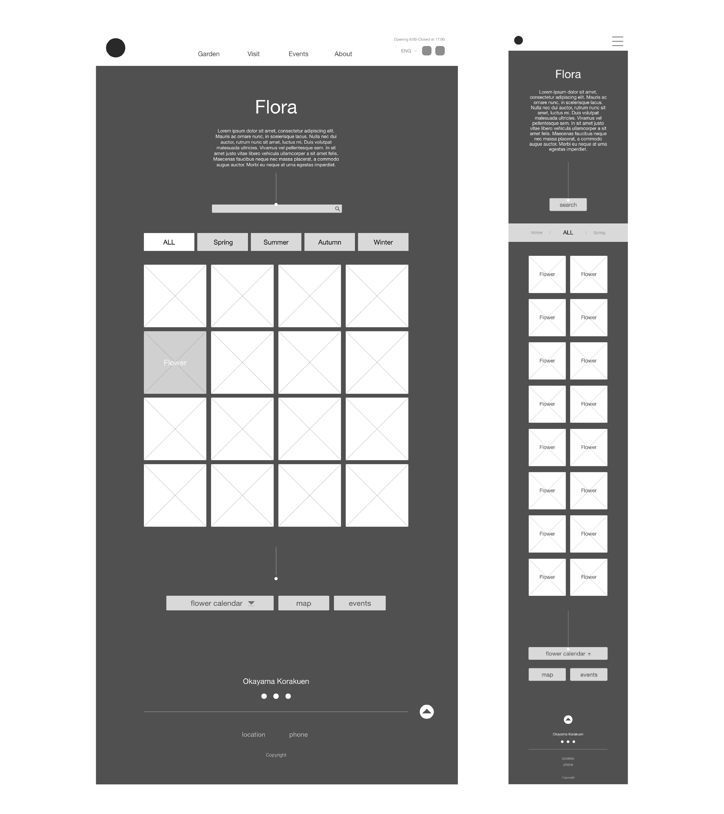
flora mid-fidelity desktop and mobile
Credits to my fellow humans
University of North Texas
Professor Erica Holeman
Fall 2020 • Interaction Design
Co-Designers
Ashley Owen
Kristina Armitage
Gizel Arreola
Images from unsplash, pexels, and the Okayama Korakuen website